Fan engagement is - obviously - all about connecting with your fans. However, it’s important to be making content for all of your fans, and that means centring accessibility practices.
The main focus of online accessibility is ensuring users with vision impairments or who otherwise need to use adaptive devices such as screen readers can fully consume content in the same way as those who don’t require such assistance.
Before I go any further, I need to flag that I am by no means an accessibility expert. My brother has Down Syndrome, and my mum was a special education teacher, so I perhaps grew up with a greater day-to-day awareness of disability than most people, but that ultimately doesn’t mean much. I’m also very much still learning and improving accessibility on my own personal social posts. However, you don’t need to be an expert to engage with resources, seek advice, and learn best practices.
Alexa Heinrich – who I was lucky enough to connect with a few years ago on Twitter and have learned from ever since – has made mastering these best practices so easy, you basically don’t have an excuse. She’s created a resource called Accessible Social that gives you everything you need to know about making accessible social content in one place. It’s truly brilliant, and I’ll be quoting it throughout this post.
Alt Text 101:
Because I am one person doing all of my tracking by hand, I’ve primarily narrowed my scope for this particular post to the use of alt text on Twitter.
Alexa points out that alt text and image descriptions are technically two separate things, however as Twitter uses “alt text” as an overall descriptor and marker on their images, I’m using it as a short-hand in this post.
She explains:
“Images play a key part in digital storytelling, marketing, and social media. But how does someone with a serious vision disability or individuals who use assistive technology experience a picture online? Assistive devices and programs need textual information that provides a descriptive summary of an image’s key visual details. This can be done through alternative text—more commonly known as alt text—or image descriptions … The purpose of an image description is to provide additional context and information about a visual … Image descriptions may include details such as the colors, shapes, sizes, textures, and other elements in an image, as well as its context and meaning.”

An example of a tweet with alt text that I shared from the Australian Grand Prix
Japanese Grand Prix: Inaccessibility Galore
The Japanese Grand Prix is one of a few races on the calendar that exists in a lovely time zone to watch live for us here in Australia. I decided to make the most of that convenience and use the weekend as a time to track the way the teams (and F1 themselves) use alt text on the images they share.
I tracked all posts shared on Twitter/X from all ten teams and the F1 account between the start of media day on Thursday 4th April and the end of race day, on Sunday 7th April.
What I discovered was an embarrassment of inaccessibility from every single team.
Across the weekend, 548 tweets including static images were shared by the ten F1 teams. Just ten of these included alt text. That’s 1.8% of all content shared over the four days being accessible to any fan using a screen reader or similar assistive device.
Let that sink in for a second.
Team | Total Images Shared | Total Images Featuring Alt Text | Total Results Images Featuring Alt Text |
|---|---|---|---|
Alpine | 52 | 0 (0%) | 0 |
Aston Martin | 48 | 0 (0%) | 0 |
Ferrari | 79 | 0 (0%) | 0 |
Haas | 83 | 0 (0%) | 0 |
McLaren | 74 | 0 (0%) | 0 |
Mercedes | 64 | 0 (0%) | 0 |
RB | 29 | 0 (0%) | 0 |
Red Bull | 52 | 3 (5.8%) | 0 |
Sauber | 26 | 1 (3.8%) | 0 |
Williams | 41 | 6 (14.6%) | 0 |
The worst part is that none of the results graphics shared by any team across the weekend included alt text. Zero. Zip. Nada.
What does that mean? If I’m a fan using a screen reader who couldn’t tune in live to the practice sessions, quali, or race and went to the social media page of my favourite team to find out how they went…well, tough luck to me. If we look at just the race day results posts, only four of the ten teams included the results in the text of their post. Doing this is not a replacement for adding alt text, however, including the information in both locations is best practice for accessibility purposes.
I didn’t count the posts from the official F1 page, but I did take note of every results graphic they shared and none of them included alt-text. That’s absolutely inexcusable behaviour from an account representing a global sport.
I’d bet at least some of the teams will use how busy live updating during a race is to try and justify their lack of alt text on some of their posts. But friends, when all you’re sharing during the busiest part of the weekend is pictures of your cars either on track or in the pits, guess what? You can pre-write that alt text! Here are some examples:
[Driver name]’s [Team/Car name] on track at [circuit name]
[Driver name]’s [Team/Car Name] during a pit stop
[Driver name] in an on-track battle for [position] with [opponent’s name] on [lap number] at [circuit name]
Say it with me now: If you have time to write a caption, you have time to write alt text. You are never, ever too busy to create accessible content.
Similarly, in the time it takes your designer to update your results graphic, you can write your alt text! Here’s a bare-bones example you can copy, and it took me ten seconds to type out.
Result from [race name]: [driver name]: P[X], [driver name]: P[X].
Alt-Text Examples
Bizarrely, three teams used alt-text on random images across the weekend. None of these images were sharing key information, but it demonstrates that the teams do know how to use the function, and are just actively choosing not to.

One of six posts from Williams including alt text

The only post from Sauber including alt text

One of three posts featuring alt text from Red Bull Racing
Hall of Shame: The Season So Far
Moving from this specific weekend to the overarching season, I’ve created an Accessibility Hall of Shame for some truly terrible examples of accessibility practices I’ve seen across the first four races of the year. I hope I won’t have to update this as the year goes on, but I’m betting at least a few teams will get themselves added before too long.
Australian Grand Prix - Inaccessible Accessibility
Like most F1 adjacent accounts, the official Australian Grand Prix social media accounts do not use alt text. However, what specifically gets them into the Hall of Shame is the fact they neglected to use alt-text on posts about accessibility at their event.

To not have alt text on a post such as this is as ignorant as it is embarrassing. If you’re not including alt-text when writing about accessibility, why should the audience trust any of your other accessibility practices? What faith are you giving them that you care at all?
Williams Racing - Inaccessible Statements
During the Australian Grand Prix, Williams Racing had to release an important statement on social media. They did so by posting the statement in images, which at first glance seem to have alt text included. However, upon clicking the al -text button, the team had not used it for its intended purpose and had rather just written that the images were of a statement rather than including the statements themselves.

A screenshot of the statement

The alt-text that was included instead of the actual statement

The alt-text that was included instead of the actual statement
Firstly, as Alexa reminds us, flattened copy (i.e. posting a statement via image or PDF and uploading it online) is not accessible and should never be used to share statements. As she notes, “graphics created for social media should be treated like billboards”.
Secondly, if you’re going to ignore best practices and include your statement in an image, you need to use alt text correctly so that individuals using screen readers can access the message. This is even more important if – as was the case with Williams – you don’t link to an accessible version of the statement housed on your website.
Thirdly, even for users not using screen readers, the statement is a visual nightmare. If it gives you a headache to look at, you should realise you’re doing something wrong.
Everyone has a right to access important information. You simply cannot cut people out of the conversation by ignoring accessibility requirements.
McLaren, Williams and Red Bull - Unicode Font Fails
“Upside down” is an easy joke to make when you’re referencing Australia, and in the lead up to the Australian Grand Prix we saw a number of teams make the joke via the use of upside-down text.
While it’s a fun visual gag, upside-down writing is created using Unicode font, which can’t be read using most screen readers. This means that the messages are completely inaccessible to anyone using a screen reader.
As Alexa lets us know, “using characters and fonts from external websites is detrimental to the accessibility of digital content”.
The Golden Rule? If it’s not a formatting option on the website you’re using (i.e. you have to copy and paste from another site), you shouldn’t be doing it.

McLaren’s attempt at Australian humour

Williams with the double whammy of inaccessible font and no alt text
We saw McLaren and Williams use the font on social media, and then McLaren and Red Bull Racing went a step further and used it in their email subject lines.


I used a free screen reader chrome add-in to test what the subject line sounds like to those using such devices, and as you can imagine, it’s not great!
If one of your fans is using an assistive device to read their emails and your subject line is nonsensical, you’re doing a very poor job at actually speaking to your audience.
How to improve
To paraphrase Sheri Byrne-Haber, don’t let the fear of not doing accessibility “correctly” stop you from trying. As we can see from the above stats, just making an attempt is better than what literally everyone else in the field is doing.
The good news is there is an amazing amount of education and resource content available to help you learn not only how to make your content accessible, but to remind you why you need to be doing it.
If you work on a social team who aren’t currently creating accessible content, I cannot recommend Alexa’s Accessible Social enough. It’s your one-stop-shop, and also includes an amazing amount of links to other resources. Run, don’t walk.

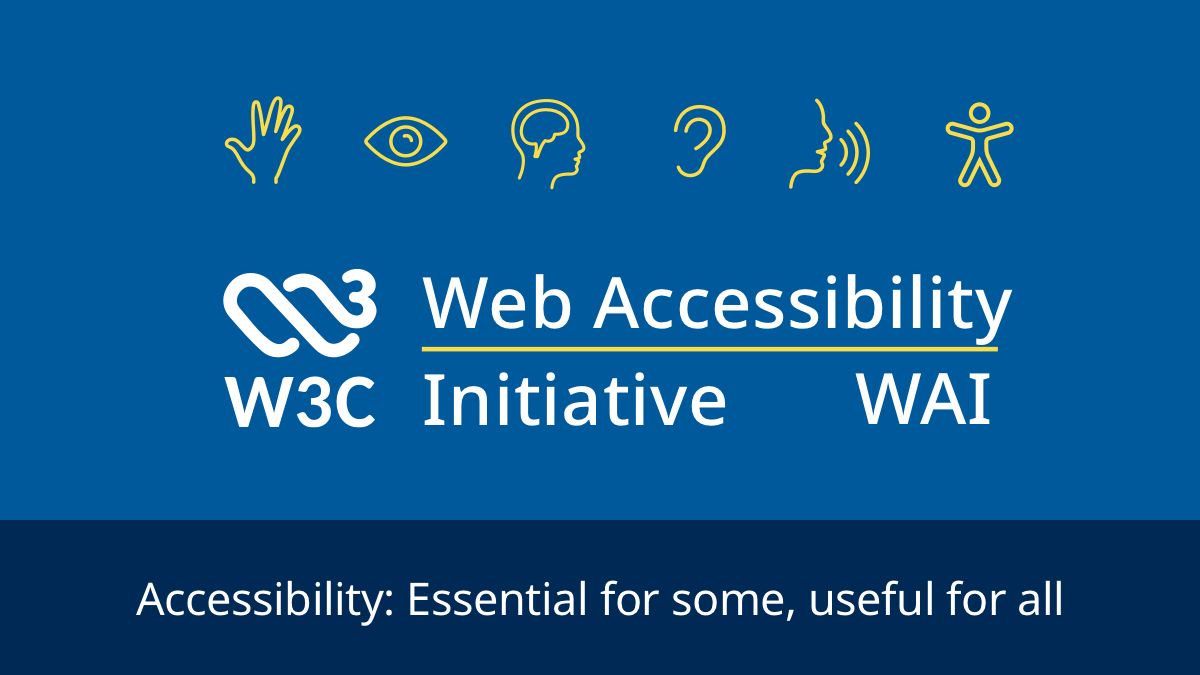
If you want to get technical, the World Wide Web Consortium (W3C) is behind the official standards and guidelines for official web content. The Web Content Accessibility Guidelines (WCAG) outline everything you should be doing when it comes to online accessibility, but I’ve also linked to the sub-section on writing for web accessibility.
Sheri Byrne-Haber’s “Giving A Damn About Accessibility” is a candid accessibility guide that lays down the law (and calls out your excuses)
The “Accessibility Awareness” Twitter account shares regular tips, resources, and reminders of best practices
And if you’re reading this and you work for an F1 team – I’m going to go out on a limb and say you have enough money to pay an accessibility expert to come in and give you expert best practices tailored specifically to you.
The important thing is that you need to try. Nobody is asking you to write the world’s most beautiful alt text, but they are asking you to not cut your fans with disabilities out of the conversation.
While I won’t have the energy to track every post for accessibility every week, I will be noting what I can, and paying special attention to the results posts shared as a key piece of content. I hope that magically by the Chinese Grand Prix in two weeks the teams will have realised the error of their ways…but I’m also not holding my breath.