Hello and welcome to another edition of “Georgia gets frustrated with how little Formula 1 teams think about accessibility”!
Jump to:
Background
I recently attended the World Down Syndrome Congress in Brisbane, hearing and learning from people with Down Syndrome, their families, and their advocates. While I was there in my capacity as a Sibling, I couldn’t help but think about my work in fan engagement and just how much the ball is being dropped. The harsh truth of the matter is that fans with intellectual disabilities are usually ignored by organisations with their accessibility requirements put in the “too hard” basket.
But it’s not just fans with intellectual disabilities. It’s also another invisible group of fans: those with low levels of literacy. You may be wondering how many people that actually includes, so let me blow your mind (in a bad way) with some stats:
In Australia:
In the UK:
In the US:
Tracking Accessibility: 2.0
I’ve previously explored social media accessibility, but today wanted to turn my attention to two areas specifically related to accessibility for fans with intellectual disabilities and low literacy levels. These are:
Claims about inclusion in official company reporting
Website accessibility
Inclusion Claims
References to inclusivity fall under each team's corporate sustainability strategies and reporting. In almost all cases, inclusivity is used in this context to refer solely to employees, and when referring to the wider community, it focuses on gender, race, and sexuality rather than disability.
After reading the sustainability statements of each team and the relevant sections of their reports (where they exist), I’ve split the teams into those who make a reference to inclusivity outside of their hiring practices (3/10), and those who don’t (7/10).
Teams with mentions of non-employee inclusion
Aston Martin make a passing reference to “Ability” in their sustainability report, but no examples of working with individuals with disabilities are actually provided.
Mercedes refer to “trackside outreach” in their sustainability report, and give examples of things such as the “neurodiversity pit lane walk” at the Melbourne Grand Prix.
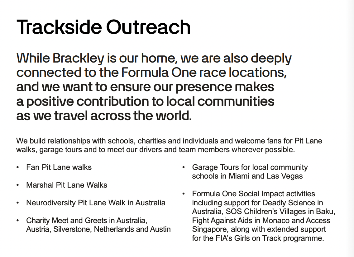
Red Bull make the clearest statement about inclusivity and accessibility for fans, but haven’t provided any examples of what this means in practice.
Teams without mentions of non-employee inclusion
Note: VCARB driver Yuki Tsunoda recently found himself in hot water after using the R-word on team radio. Afterwards, he claimed he didn’t know the meaning of the word, just the context in which it is most frequently used. Given that he has previously said he learnt English from being in the team garage, I hate to think about how “inclusive” VCARB are in reality!
Website Accessibility
When it came to exploring website accessibility, I decided upon a simple test broadly based on some of the talks I heard at the Down Syndrome Congress. This test involved visiting the website and seeing how difficult it was to navigate to a very central piece of information: driver bios.
I also paid attention to teams who specifically called out accessibility anywhere on their site.
Accessibility Considered
Ferrari
Edit 25/7:
I should have been clearer in explaining here that Ferrari are using an accessibility overlay which should not be considered a permanent solution. Accessibility overlays are widely considered problematic by people with disabilities, especially those with visual impairments, as they can interfere with existing adaptive technologies and act as a bandaid solution. For the sake of literacy and web navigation for individuals with intellectual disabilities who may not be using other technologies, these tools can make a big difference. However, they do not replace websites where accessibility has been considered from day one of website design. Ferrari should not be considering this an accessibility box ticked, and while it shows they have put more thought into it than anyone else on the grid, they should still be looking to build a website that meets proper accessibility guidelines and requirements.
End Edit.
Ferrari are the only team on the grid who are actively taking steps to make their website accessible.
I will caveat this by saying you have to know what you're looking for, but the little dude** in the image below unlocks an accessibility menu

As shown below, there are a range of different pre-set options for accessibility requirements, such as vision impairment, seizures, and cognitive disabilities. It also has a dictionary and further options for customisation.
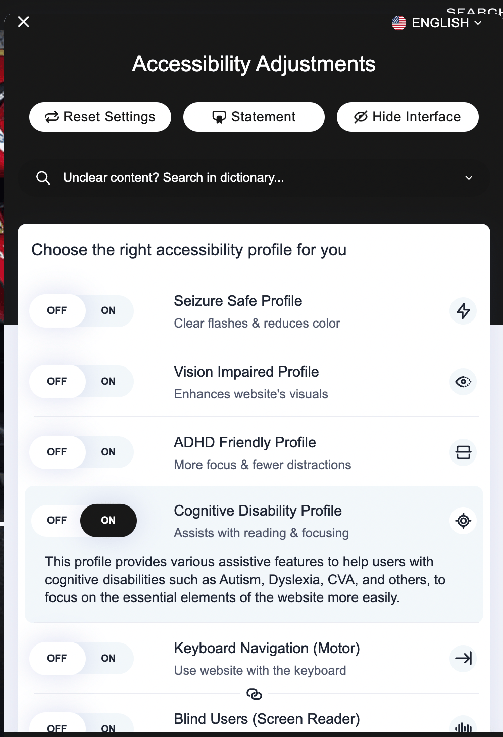
The accessibility menu
They also have an accessibility statement that calls out their commitment to follow WCAG guidelines.

The start of their accessibility statement
To demonstrate some of these filters in action, I visited a news article and took two screenshots.
This is how the page looks to an everyday visitor.
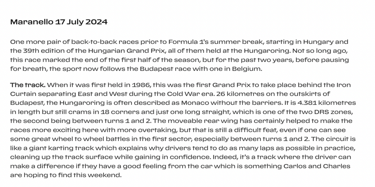
And here’s how the same information looks with a number of accessibility filters applied:
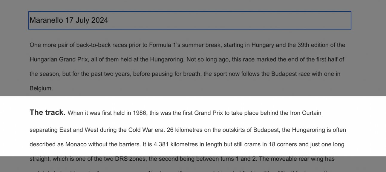
You can see the difference in being able to change the font family, size, and spacing, as well as being able to use a focus filter to emphasise the text you’re currently reading.
It’s still not super easy to find information on their drivers on the website, however I do like that the accessibility tool itself has a key links section that lets you jump directly to some of the main pages, which includes the driver profiles. While I’m not sure how easy this would be to navigate for someone with low literacy, it’s at least another option.
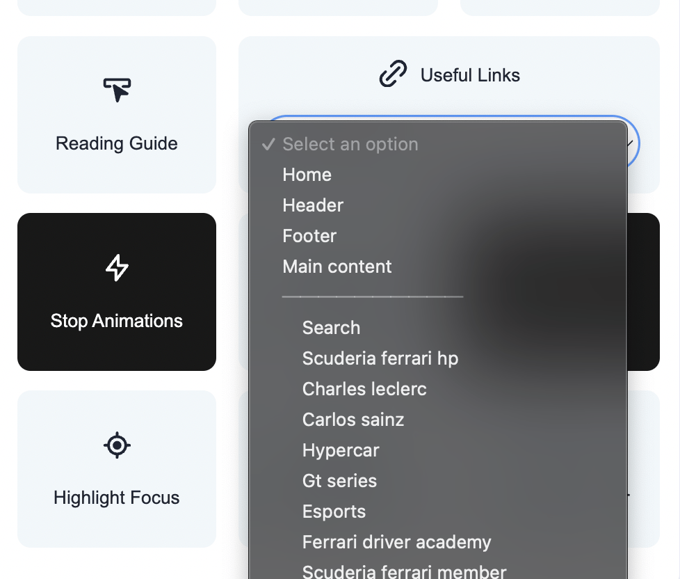
While this isn’t a perfect solution, it shows an effort is being made and has a very real impact.
No Accessibility Considered
And now to the other nine teams, who – as far as I can tell – have put zero thought into making their websites accessible.
Alpine:
Alpine’s website has had no effort put into accessible design.
Fans would have to know to scroll to find driver information or to locate it in the menu bar (which takes multiple clicks - a proven barrier for fans with disabilities). Once you do find the drivers, you realise that the large images and names are not hyperlinked. This is a big design flaw, as users automatically click on the most visible part of the layout. And for a fan with low literacy, they know to click on a face as a familiar symbol, but may not know to look for the words “find out more” (or be clear on what those words would do).
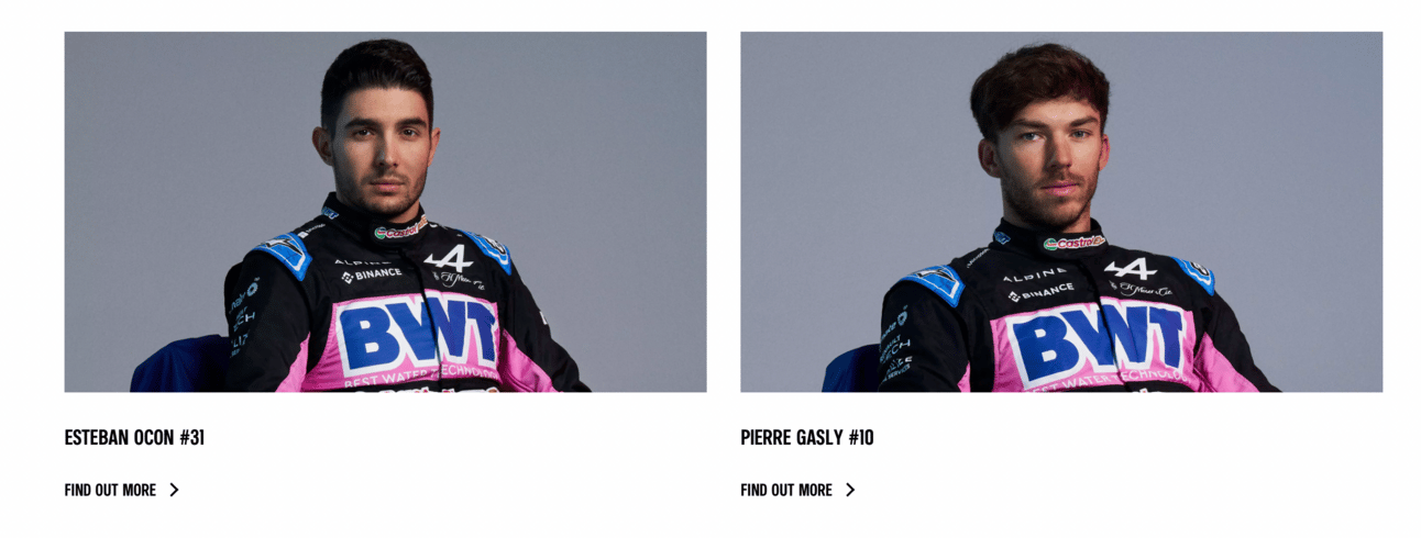
Why can’t I click on their faces?!
When you manage to get to the bio pages, there’s a confusing mix of French and English, and information is not laid out in a straightforward way. It’s also quite out of date, featuring information from 2023 rather than the current season.

Why is this in French? Nothing else is in French!
Aston Martin:
Aston’s website looks fancy but is a nightmare to navigate when it comes to accessibility.
Firstly, even for someone like me who has no accessibility requirements, the menu bar is almost impossible to locate. It blends into the background of their full-screen image and is so tiny in size it’s easy to overlook. Someone with poor web navigation skills has no hope.
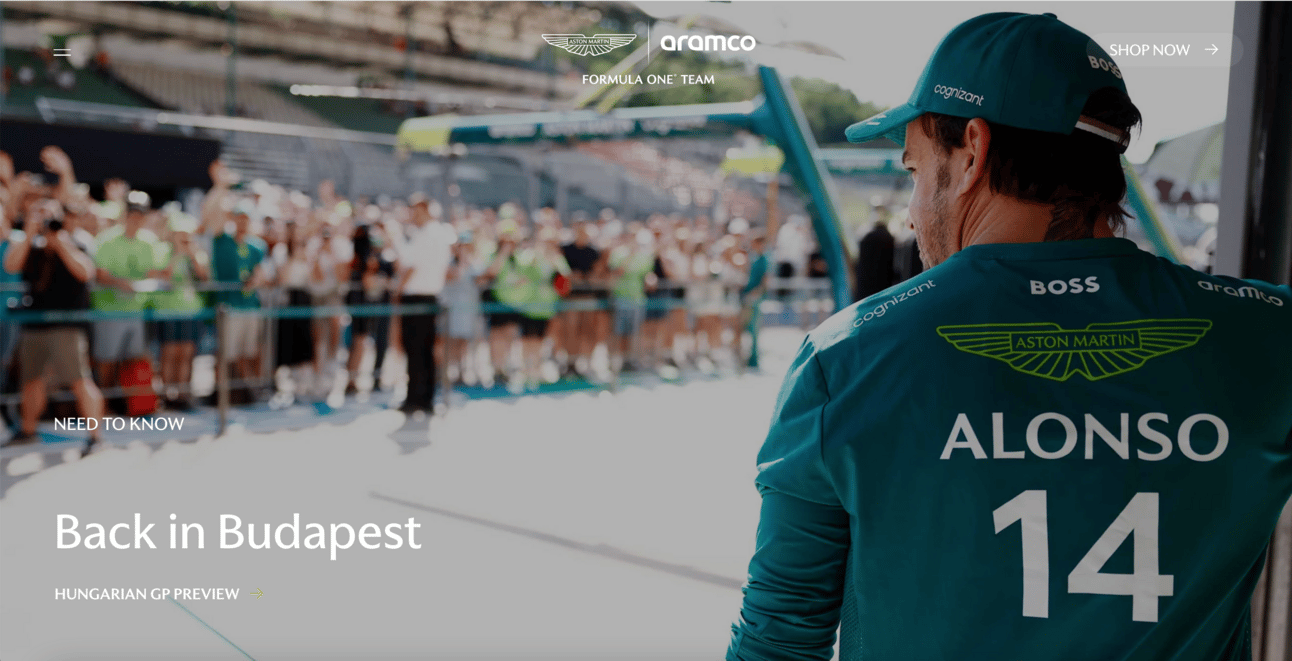
Spot the menu bar
You also can’t find any information on the drivers on the homepage, so fans seeking this information have to use the tiny menu bar and then navigate to “racing” before finding the driver names in another list. This is a huge hurdle for fans with low levels of literacy and/or navigational skills.

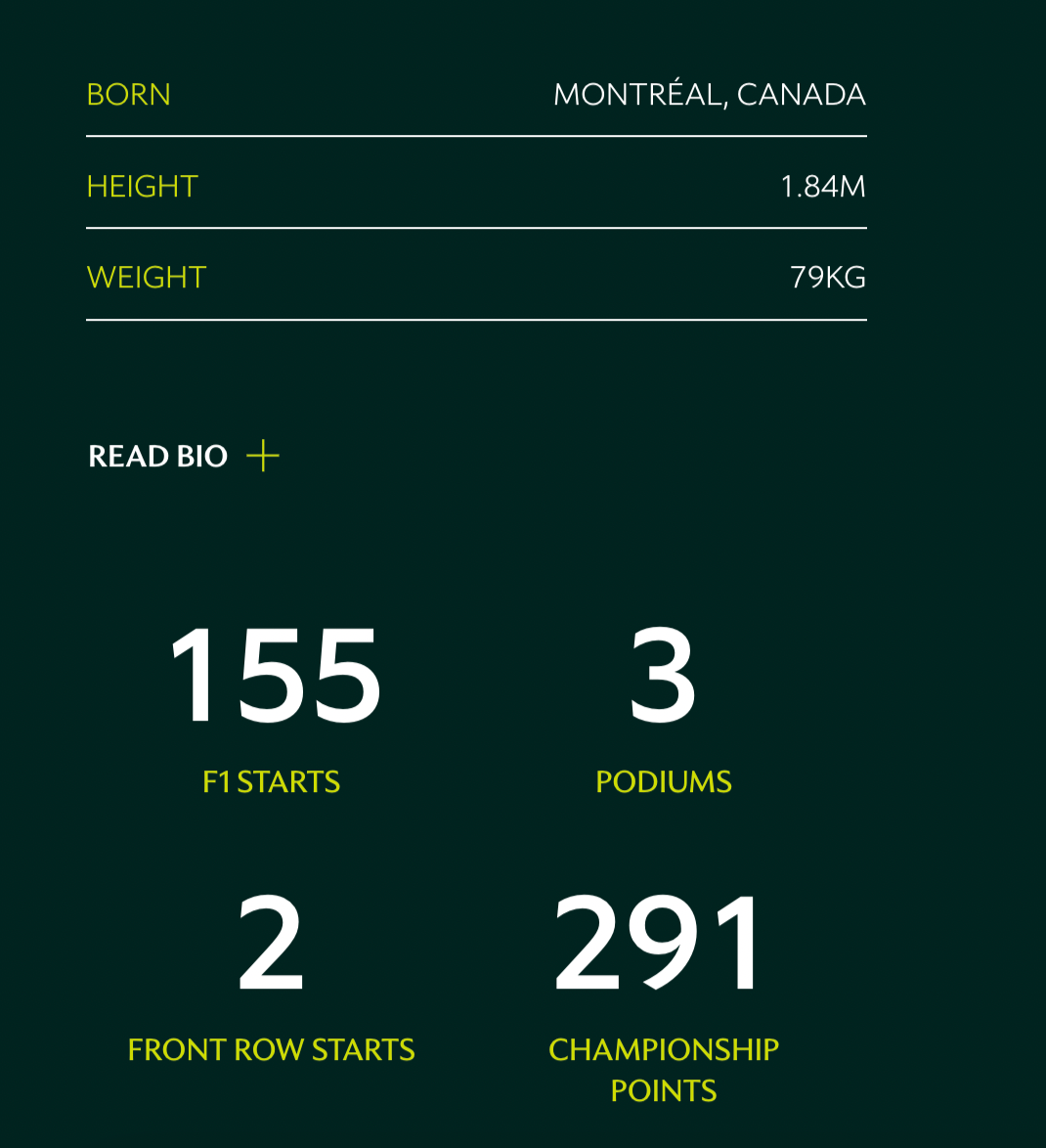
If you do manage to make it to the driver pages, key info is at least clearly outlined. Large numbers are easier to understand than words, and pulling out important stats that fans may be interested in is more accessible than hiding it in a long paragraph.
Haas:
Haas’ homepage is visually busy, but at least you can see the drivers in your first view. That said, it is easy to get overwhelmed by how much is going on at first glance, and fans may face some difficulty in spotting the drivers.
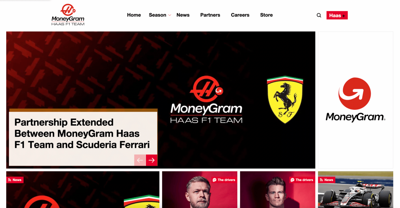
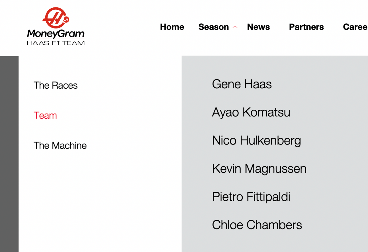
If fans are looking to navigate through the menu bar, they would have to know to click “Season”, and then “Team”, which is much more difficult than having “Drivers” clearly signposted. It’s not helpful to have the drivers buried in the middle of this list, as fans are much more likely to be looking for info on them than on Gene or Ayao.
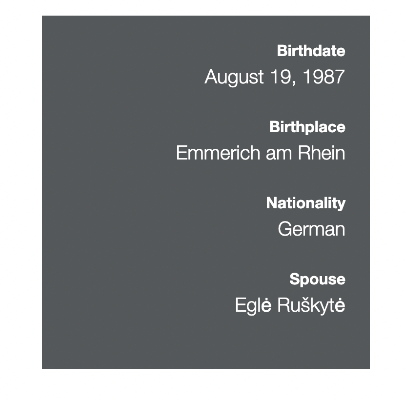
Like Alpine, some of the information on the driver pages is out of date. It would also be good to see key stats related to their career pulled out into the box that currently only features top-line biographical info.
McLaren:
It requires four scrolls*** on the homepage (or knowing to click “team” in the busy menu area) to reach information on their drivers, which isn't ideal in terms of accessible navigation.
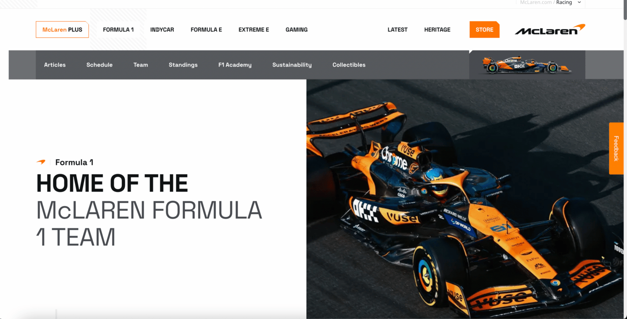
When you do reach the drivers’ section, it’s easy to click through from their very large pictures. However, the actual information on each page is not laid out in an accessible manner.
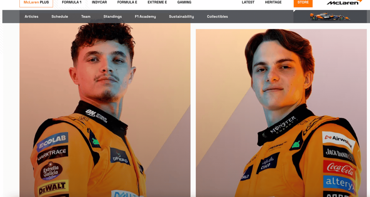
I know this is very nit-picky of me, but this layout needs some colons or bolded text! It shouldn’t feel as hard to read as it does!
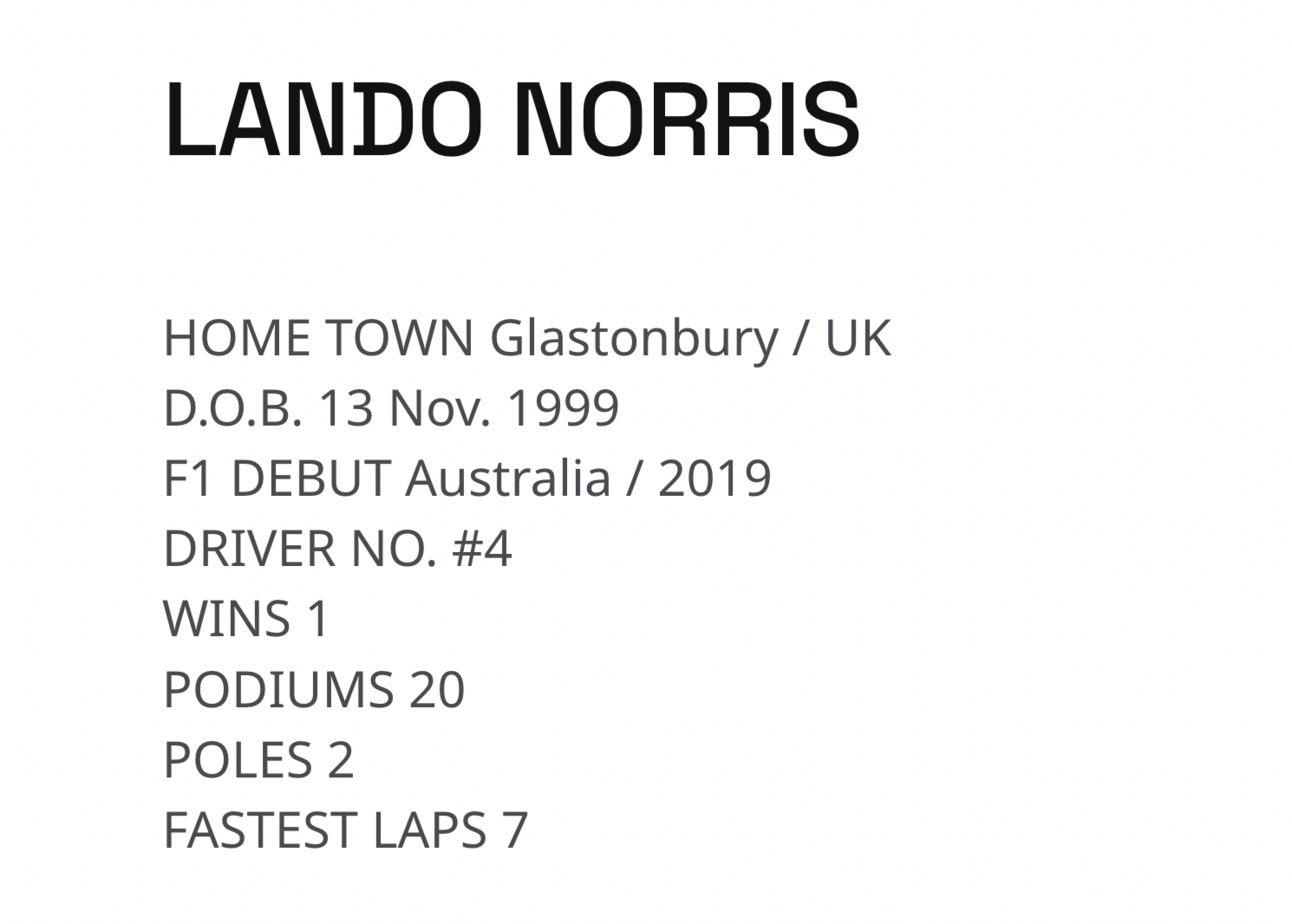
This formatting hurts my brain
The rest of the bio information is told in a paragraph life-story format, which is a lot less accessible than emphasising the kinds of key info fans would come looking for. Fans are not official sponsors or media, and they’re usually seeking different kinds of info written in clearer ways!
Mercedes:
Mercedes have a very fancy website. Unfortunately, this doesn’t translate into accessibility. The homepage immediately overwhelms you with content, and unfortunately, none of it is helpful in finding information about the drivers. The biggest flaw of the initial display is that it includes the drivers’ names, but they’re not hyperlinked through to further information. If I’m a fan with low literacy who logs on looking for information on a driver, I’m going to be looking to spot their names. It’s not helpful at all for that not to be a pathway to the information I’m looking for.
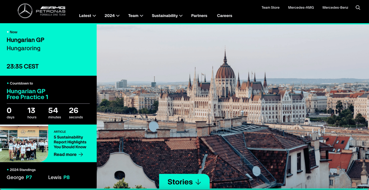
Fans must make three separate menu selections to find information about the drivers. When you eventually end up on the driver page, I do like how clear these selection options are. However, that’s where the simplicity begins and ends.
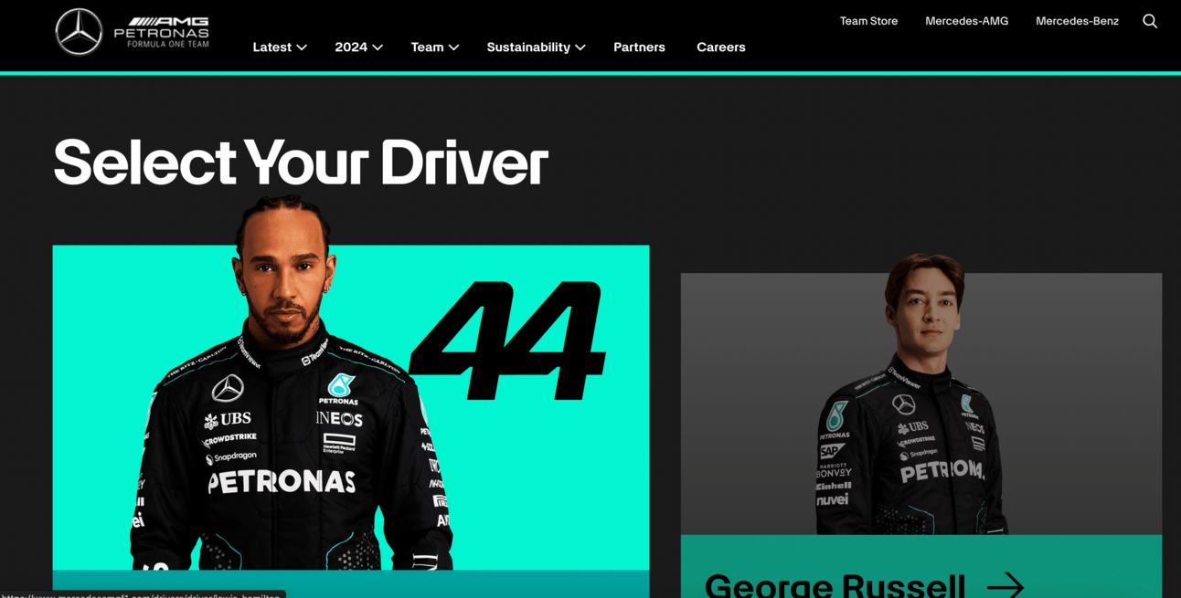
The biography page you end up on is animated in such a way that information is hard to parse. The animations are also glitchy, with it taking me multiple attempts to get the scrolling information to actually pause to show me Lewis’ statistics. For fans with digital literacy skills, the below format is a fun way to present a timeline. Unfortunately, for fans with intellectual disabilities and other barriers to web navigation and literacy, it’s unclear and unlikely to be accessible to them.
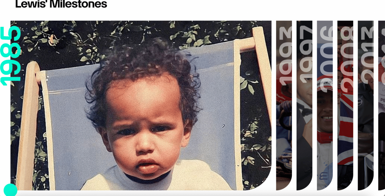
It’s not immediately clear that fans should be clicking on the columns, especially as the years aren’t fully visible (lewis is a cute baby, though!)
Red Bull:
Information on the Red Bull drivers is buried halfway down their homepage. Before we reach there, we have to scroll past this monstrosity of visual inaccessibility. Can someone please teach Red Bull about the importance of contrast and readability?!
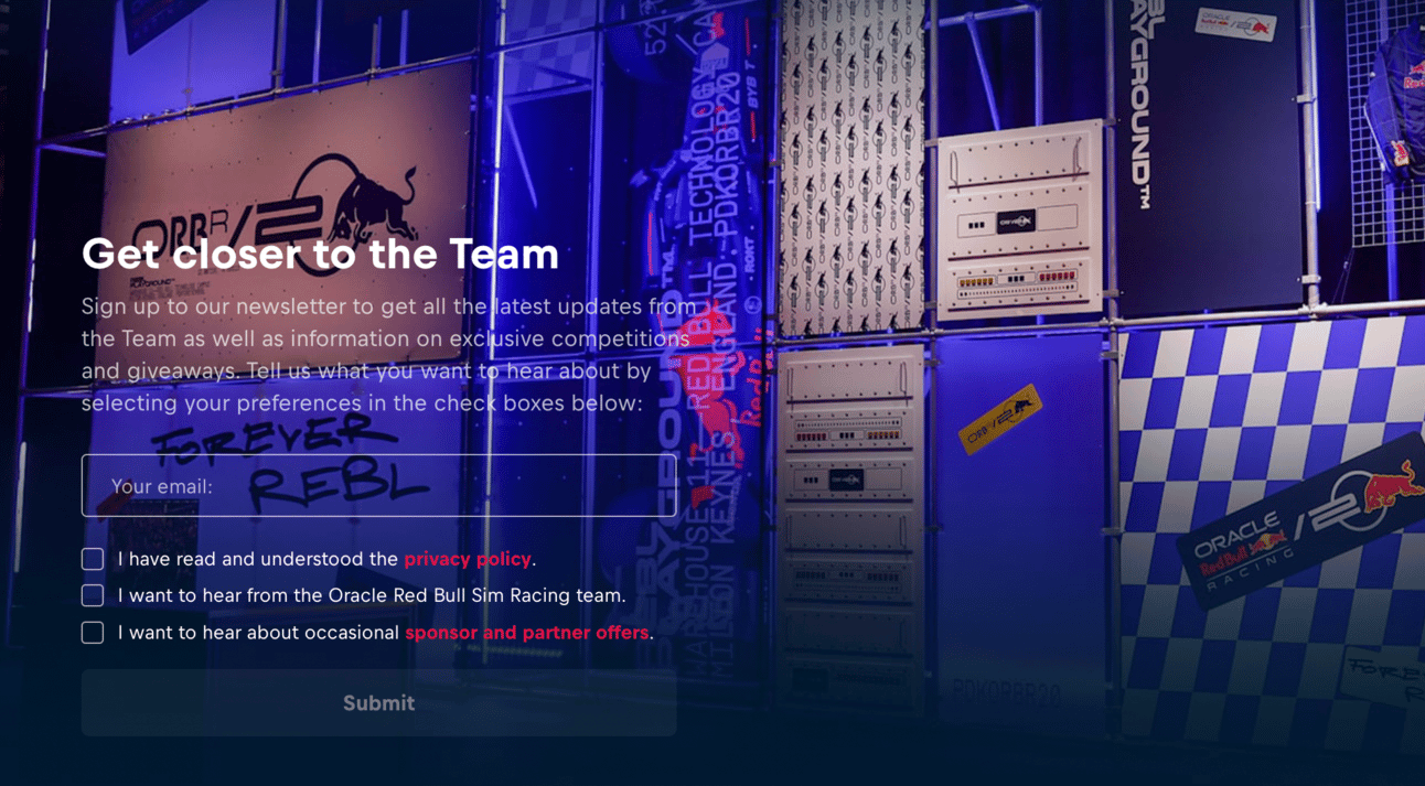
When you do find the drivers, their names and images are super clear. Frustratingly, however, these are not hyperlinked, with fans instead having to click the tiny “view profile” button to get more info. They also have a horizontal navigation to switch between Max and Checo, which wasn’t even initially clear to me.
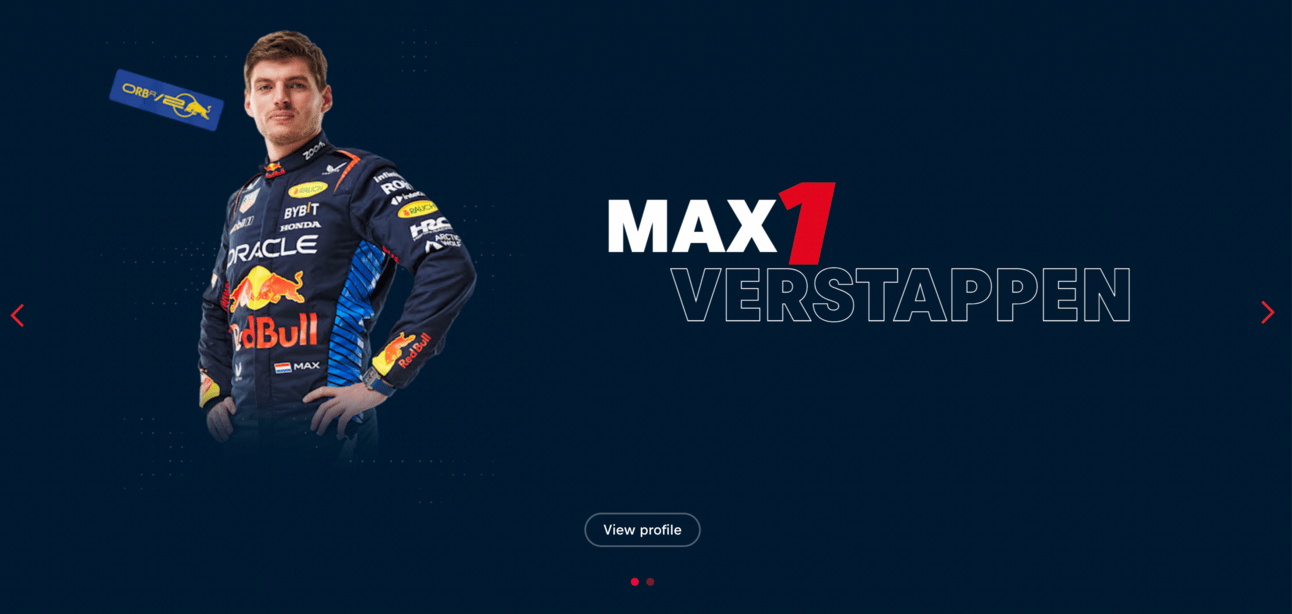
Spot the navigation tools
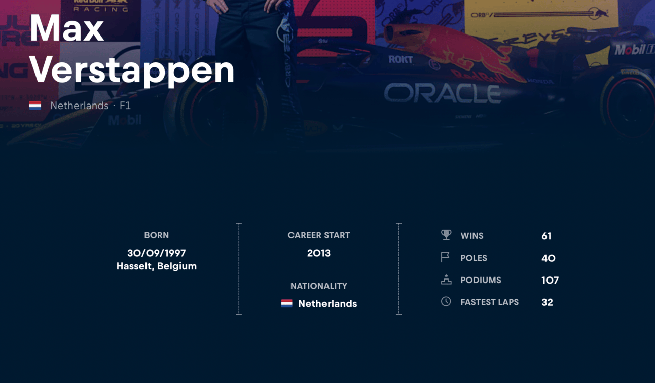
Once you reach the driver bio page, the information is perhaps the most clearly set out of all of the teams (icons and visual symbols are super helpful for fans with lower levels of literacy)…but that doesn’t matter if it’s too hard for your fans to reach the page in the first place!
Sauber:
Sauber perhaps has the most inaccessible of all of the websites, which is saying something. Their homepage scrolling navigation moves too quickly, jumping between full-screen news items.
To reach information on the drivers, fans have to know to navigate to “racing” on the menu bar and then locate “drivers”, buried halfway down the list.

When you do land on the drivers’ page, you’re hit with a giant video rather than actual information. Fans are expected to know to scroll down to find the driver bios, which may sound simple but when someone has low digital literacy skills, they’re more likely to exit the page.

The very helpful view from the top of the driver page
If you thought the actual bio pages would lay out information in a clear way, you’ll be disappointed to learn they’ve added another full-screen video above the information. Truly a painful navigation experience.
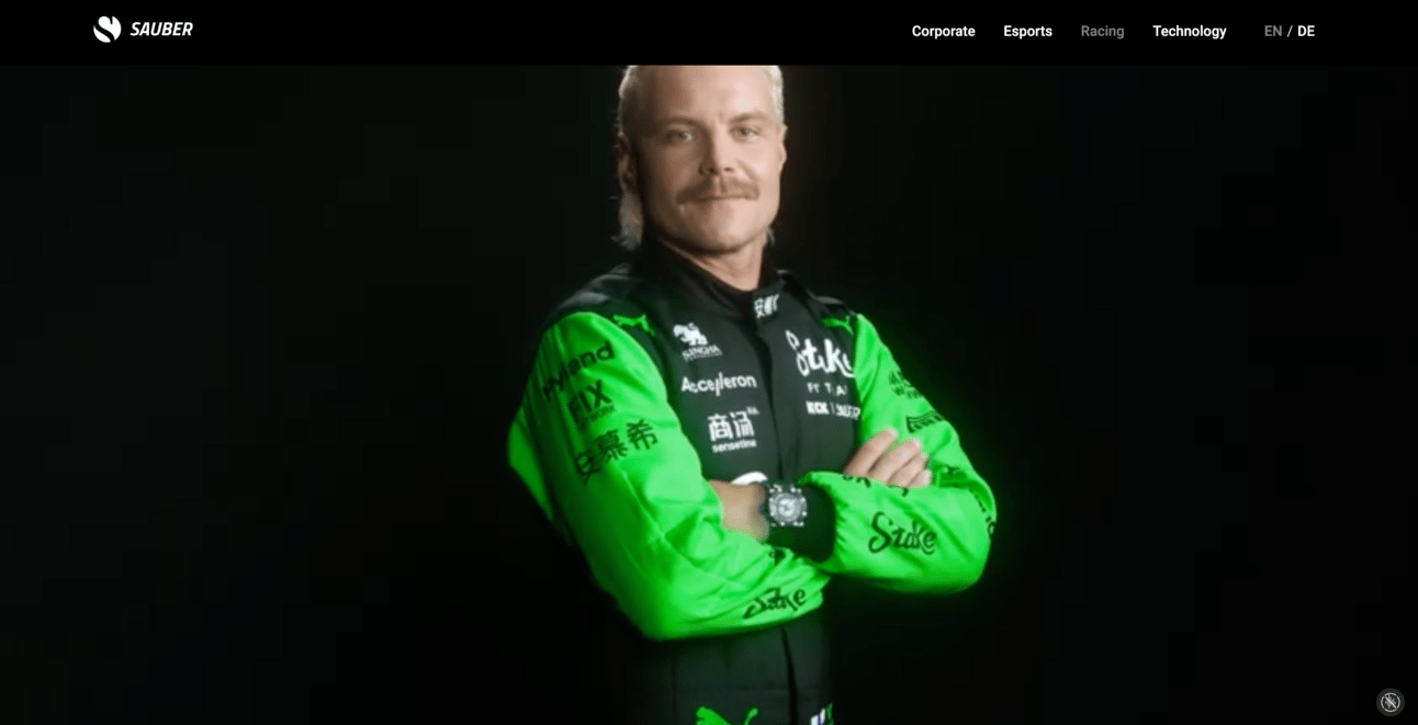
I love Valtteri, but I’m trying to find his bio, not another full-screen video
VCARB:
It takes four scrolls*** on the VCARB website to reach the pictures of their drivers, and like Aston Martin, their menu is hidden behind a tiny symbol that fans with lower literacy may not be familiar with.

After scrolling down and finding the driver images, clicking on them rolls over a tiny bio rather than taking you through to a whole new page.
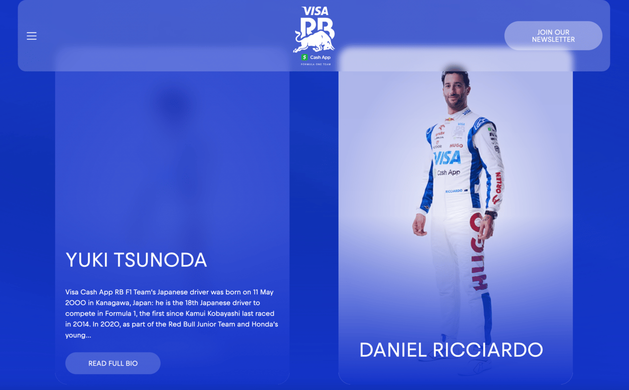
Making fans click a small button that says “read full bio” is poor accessibility, as is the way they then lay out information on the bio page.
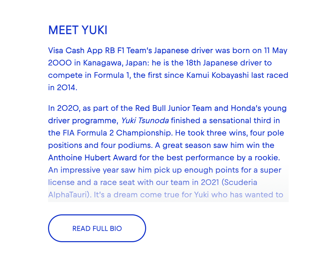
Fans are looking for clear, up-to-date information on drivers, not to read their life history (at least in the first instance).
Williams:
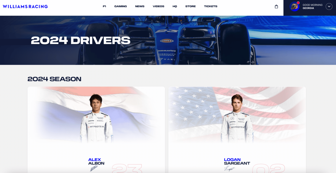
Williams have a very busy homepage, and bizarrely, like Aston Martin, you can’t actually access information on their drivers by scrolling through any of the featured content.

Their driver info is hidden under the vague “F1” label on their comparatively small menu bar. While the initial driver page is clear to navigate, the information each page contains is the life-story form of bio rather than presenting key information in an accessible way.
What does this all mean?
Nine of the teams have a lot of work to do.
The first step should be having their web teams familiarise themselves with WCAG guidelines and why they’re important to follow.
It’s then important to consult with groups who actually have these accessibility needs. They’ll be able to advise you on the key issues with your website, what would make it easier for them, and how they would like to be included as fans.
Organisations are often afraid of alienating fans without disabilities by creating clear, accessible content. But you have to ask yourself: why do you think it’s okay to alienate the fans with disabilities?
Further Steps for Better Inclusivity
In addition to the above, here are some other steps that organisations can take to ensure they’re including all of their fans:
Remember that accessibility is much more than just physical considerations.
Prioritise accessible web content over flashy websites and glitzy graphics
Create plain English and Easy Read resources for those with low literacy levels, and where possible, ensure there are options for digital content to be easily read-aloud
Remember to include adults. There are a lot of great programs that provide opportunities and access for children with disabilities but ignore their existence once they reach adulthood.
Avoid seeing people with a disability as a token or, worse, a “mascot”.
And as always, use alt text, clear captions, and accessible visuals
*The UK refers to intellectual disabilities as “learning disabilities”, reflected at the link. This is distinct from learning difficulties, such as dyslexia and ADHD.
** I’m sure he has a proper name, but he’s just a little dude to me.
*** I’m just referring to scrolls as a universal term of measurement. YMMV.


